Charts - Data Visualization Part 1: Statistics #5
In this article, we're going to start our two-part unit on data visualization. Up to this point we've discussed raw data which are just numbers but usually, it's much more useful to represent this information with charts and graphs. There are two types of data we encounter, categorical and quantitative data, and they likewise require different types of visualizations. Today we'll focus on:
- a. bar charts
- b. pie charts
- c. pictographs
- d. histograms
Data visualizations are important to understand because you’ll see them every day. In the news, on Facebook, and in magazines. Maybe I’ll make an infographic of all the places we see data visualizations.
INTRODUCTION:
There are two main types of data that we might encounter:
i. Quantitative
ii. Categorical
Quantitative:
Quantitative data are quantities, and numbers that have both order and consistent spacing.
For example, how many ounces of olive oil is in each American home.
If three families told you how many ounces of olive oil they have, you could put them in a meaningful order--from least to greatest, or greatest to least.
This order also has consistent spacing, an increase in 1 ounce of olive oil is the same whether you go from 0 to 1 ounce, or from 100 to 101 ounces.
These properties allow us to do simple math with the data like taking the mean or calculating the standard deviation.
Categorical:
Categorical data
doesn’t have a meaningful order or consistent spacing.
For example, my favorite kind of pasta. You might like penne, rotini, linguine, or even Angel Hair, but there’s no objective way to put those pasta into a meaningful order. Is penne truly better than linguine? Where does rotini fit in?
It would be pasta madness to try to put them in order. The simplest way to display categorical data is to make a frequency table.
To change a frequency table into a relative frequency table, we just need to take each raw frequency and divide it by the number of total points to get a decimal between 0 and 1. Some of you may be used to reading decimals as percentages, but if you’re not, just multiply by 100 to get the percentage.
For linguine, we have 10/50 which is 0.2 or 20% of the group. Relative frequency tables have the benefit of being easy to compare. No matter what we’re measuring or how many data points we have, it’s easy to compare percentages.
If 20% of people like linguine, we can see that’s a smaller percentage than the 67% of people who like pineapple on pizza or greater than the 10% of my family who thinks statistics are scary.
We could ask people to rate their favorite pasta sauce and make a combined frequency table, or a contingency table, of both pasta and sauce preferences.
If I were planning a party and needed to pick some pasta for the group, my best bets would be Rotini with Red Sauce and Penne with Red or White sauce.
And because I’m planning a party and because I’m having food, I did look it up: the chance of death by choking on food in the US in a given year is 1 in 100,686.
But sometimes we don’t want just numbers in our visualization. Earlier in the series, I talked about how it can be hard to wrap your head around numbers especially when they get really big or really small.
There are other more visual ways to represent categorical data. One way to do this is with a bar chart.
Bar Chart:
A bar chart uses the frequencies in a frequency table to create bars that have a height equal to the frequency. That way, we can compare the height of bars instead of looking at raw numbers.
Bar charts display a lot of information in a very simple graph, they can also display the frequencies of multiple variables. Let’s say we want to compare each of these pasta types with either white or red sauce. We can either stack frequencies, so it gives us the same information as our contingency table, or we can have bar charts side by side.
Pie charts are another way of displaying categorical data. They use the relative frequency of categories to portion out pieces of a Circle, just like a pie.
The higher the
relative frequency, the bigger the slice of pie a category gets.
Pie charts are useful
because our eyes are pretty good at comparing slices.
Our pasta data in a
pie chart looks like this.
Pie charts are great at visually displaying one variable. But they struggle to effectively display more than one variable, like our pasta and sauces contingency table.
pictograph:
Another way to display categorical data is a pictograph. Pictographs represent the frequency with pictures. A picture, like a collection of fruits graph, will represent some number of units.
Sometimes pictographs represent frequencies by increasing the size of the picture instead and it’s not wrong, but it’s more difficult for us to visually compare, especially for small differences, which can be misleading.
Quantitative data:
Frequency tables can be used to display quantitative data, like age, height, or ounces of olive oil in your house.
We just have to create categories out of our quantitative data first. We do that with a process called “binning”.
Binning takes a quantitative variable and bins it into categories that are either pre-existing or made up.
For example, I can say that 0-15 oz of olive oil is “Very Little”, 16-32 oz is “Average”, 33-49 oz is “A Lot” and 50+ oz is “Excessive” like suspiciously Excessive. Like Will’s 14 cats excessive.
Why do you need so much olive oil? Anyway, once I’ve binned my data, I can create a frequency table or relative frequency table, just like with our pasta example. It might look something like this.
Binning is most useful when there are pre-existing “bins” for our data. Like, you can divide age-in-years into the bins “Child”, “Teen”, “Adult” and “Older Adult” because those are pre-existing categories.
We can also take a score on a depression test and create two bins: “clinically depressed” and “not clinically depressed”.
You can see from this example that bins don’t HAVE to be equally spaced, but if you see quantitative data that has been binned, make sure that the way it was divided up was appropriate for the situation.
Unequally spaced bins can be misleading unless there’s a real-world distinction to back it up.
Say politician X wants to make himself look popular, but it seems like people in their 30s really hate him. (Probably because he said that the reason, they can’t afford a house is their brunch habit).
Politician X wants to hide the fact that over 80% of people in their 30s said they won’t vote for him. So, he does some “re-binning”.
Traditionally the data are binned roughly by decade 18 years old to 29 years old, 30 years old to 39 years old, 40 to 49...you get the point.
But Mr. X needs to
hide these hateful 30-somethings in the data.
He moved the data
around to hide the glaring group of 30 year old dissenters.
Instead of showing the truth that 30-somethings despise him, we see a more positive view of his popularity. By splitting the 30-somethings and putting some of them into two other, larger groups, he can obscure their political dissatisfaction.
Looking at this new
table, he’d win the popularity vote in each of the 5 new bins.
If I don’t show you the number of voters per bin, it seems legit.
Histogram:
Another categorical graphing method we can apply to quantitative data is bar charts. When we use bar charts for quantitative data, we squish the bars together so that they’re touching and we call them histograms.
The bars are squished together because the data are ‘continuous’ which means the values in one bar flow into the next bar, there’s no separation like in our categorical bar charts.
In histograms, like bar charts, the height of the bars tells us how frequently data in a certain range occur.
A histogram also
gives us information about how the data is distributed.
We can estimate where the mean, median and mode of our data are as well as see how spread out the data is.
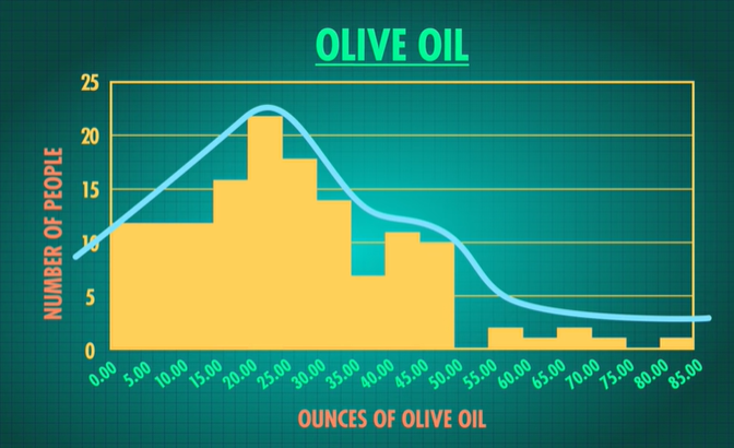
Look at this histogram for our olive oil data. For this histogram, we can see that the range of the data is approximately 85 since it covers values 0-85 ounces and that it’s right skewed (the tail is to the right), and that its center is around 25 ounces.
The histogram gives us more information about the data than a frequency table does, but they’re still obscuring WHAT the specific data values are.
If you read the news--or watch the news--you will see these representations over and over and over. You will likely see far more of these charts and graphs than you will create.
The big takeaway here, as a consumer of these things, is to look closely at what the visualization is actually telling you. Or maybe trying to hide from you.
These charts and graphs give us another way to comprehend numbers--to see the big picture.


Comments
Post a Comment